Maximalist or Minimalist?
What will be the ideal choice for our business website?
Should we stick to simplicity?
Or flaunt creativity?
Such questions often come into the mind during a website design process.
If so is the case with you, there is no wonder.
Maximalism and Minimalism have long been the reason for the dilemma.
That’s because both have their importance and advantages.
But ultimately, what to choose between the two depends on some factors.
So, in this article, we will puzzle out those factors, so you can choose the best suited for you between the two.
But before that, let’s first see what exactly Minimalism and Maximalism are.
Minimalism
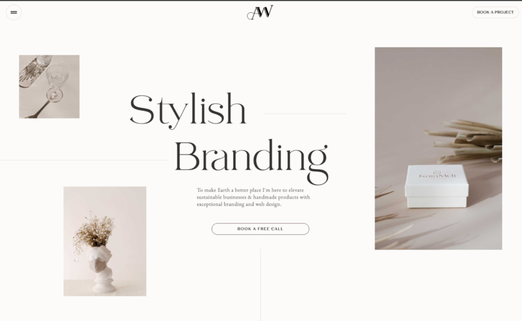
Minimalism is a kind of website design trend emphasising simplicity.
With the motto “Less is More”, minimalism involves using more white and keeping the space uncluttered.
Bright colour palettes in this kind of website design are not so ideal.
Apparently, exuding elegance and looking sophisticated remains its ultimate purpose.

Source: https://webflow.com/@adriennwhite
Will Minimalism remain a trend in 2024?
You must know that it is not a modern trend that suddenly emerged recently. Website designers have long been using it, making it an evergreen trend.
So, if you are wondering, is it going to work well this year too?
Do not worry!
It will still be trendy in 2024 and hopefully will remain so in the future as well.
Maximalism
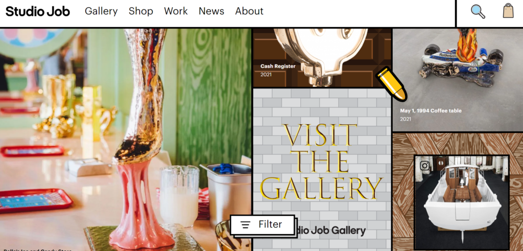
Maximalism is just the complete opposite of minimalism. That means, unlike minimalism, it goes for the maximum possible elements.
These elements are sometimes placed in the space like a mess.
Filling almost all the area with bright and bold colours in place of white spaces remains the main feature of maximalism.

Source: https://www.studio-job.com/
Besides, bold typography, dramatic imagery, multiple fonts, and contrasting patterns- to name a few are used to give a more aesthetic view.
What maximalism aims for is to show creativity.
Will Maximalism remain a trend in 2024?
In recent, maximalism in web design seems to be getting so much love. The reason is the GenZ population.
Most GenZs are crazy for-
- Creativity over simplicity
- More over less
- Innovation over convention
- Individuality over conformity
Simply, “Less is bore” is becoming the new normal over “Less is more”.
Which one is right for you?
Now that you know the difference between the two trends, what to choose for your business website is still a question. As told earlier, many factors may influence your decision. Let’s look at them.
Your Industry
What product do you deal in?
What service do you offer?
These things have a lot to do with your decision.
Usually, those with professional services like a law firm go for minimalism in website design. That is because they have more professional clientele, so they think depicting professionalism is incumbent.
While those fashion brands who want to flaunt their products choose maximalism website design services.
So, what you go for totally depends on which industry you are working in.
Your Audience
Who are your target audience?
Are they senior citizens or youngsters?
Professionals or individuals?
These things majorly influence your decision for choosing between the two
As also said earlier, most GenZs love maximalism.
So, if they are your target audience, choosing a maximalist website design is the best option.
On the other hand, if you deal in a B2B business or simply if professionals are your target audience, minimalist design will be more feasible.
Your Goal
What do you want from the website?
Is it to sell a product or service?
Or just spreading brand awareness?
Identifying your goals may influence your decision to quite an extent.
Minimalist websites are lighter in weight. The reason is obvious: they are not cluttered and use minimal possible elements.
This makes them smoother and more responsive. Also, as they are not flooded with so much content (instead, use simple layouts), users find it easy to navigate.
So, if you want to use your website as a tool for leads and conversion or sell your products or services, you would not want users to bounce back because of a complicated website.
In this sense, you may find minimalism resembling your ideal website design.
On the other hand, if your website goal is building brand awareness. A bold, eye-catching website maximalist theme can help attract attention and make a memorable impact.
Your Brand Tone
In what tone does your brand communicate with the audience?
Is it professional?
Witty?
Friendly?
Casual?
Or else?
Identifying this may influence your decision between minimalism and maximalism.
Because maximalism is mostly about creativity and boldness, those witty, casual, friendly tones can float your boat.
In contrast, if it is all about professionalism, authenticity, seriousness, or even elegance, minimalism goes well with your brand tone.
Now what to choose is up to you!
Finally, choosing between the two remains up to you. Whatever you think goes well with your niche, will ultimately be your decision. You know your offering better so will you the right web design.
However, we hope the article helped you enough to understand the basic difference between the two.
If you have already decided which design should be ideal for your website and looking for a web design company to put that into practice, we can help!
With ten years of experience in website design services, we can help you bring your project to life.
Check out our web design packages or call us on this number
+91 901 276 4000
A team of digital marketing professionals who know the Art of making customers fall in LOVE with your brand!
